CommentsPUBLIC HEALTH-According to the American Lung Association, the Los Angeles – Long Beach area has the worst air quality in the Nation.
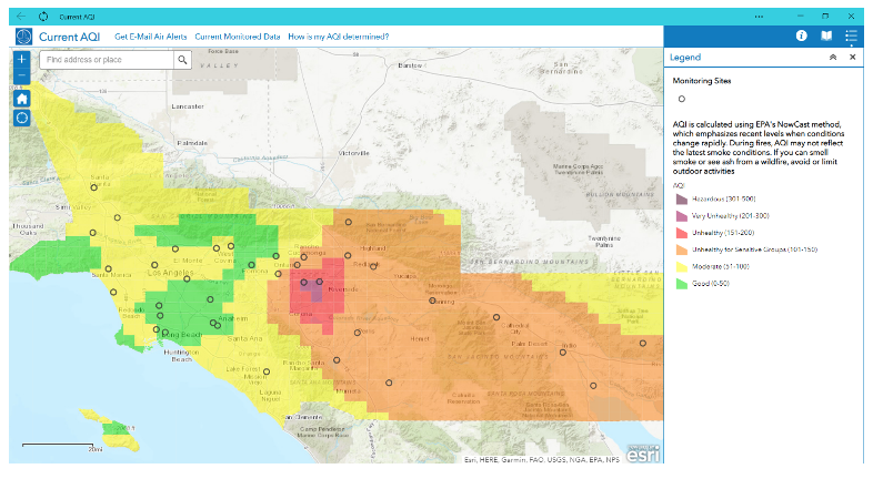
(Graphic: Current air quality index map from the South Coastal Air Quality Management District – February 25, 2020 at 3:00 a.m)
Last year, due to the combination of the pandemic and our “Stay at Home” orders, the intense heat in the summer, and the wildfires that no longer know a season, I found myself constantly checking the South Coastal Air Quality Management District (AQMD) website for our current air quality.
I receive daily notices from the AQMD with the notices for my air quality district (West San Fernando Valley). However, those notices are based upon the monitors used for the Federal Environmental Protection Agency’s (EPA’s) Monitoring System. This is a link to the airnow.gov map for the United States.
On September 6, 2020, when Woodland Hills, California reached a record high of 121 at Pierce College, I took a screen shot of the map that I found on the AQMD website.
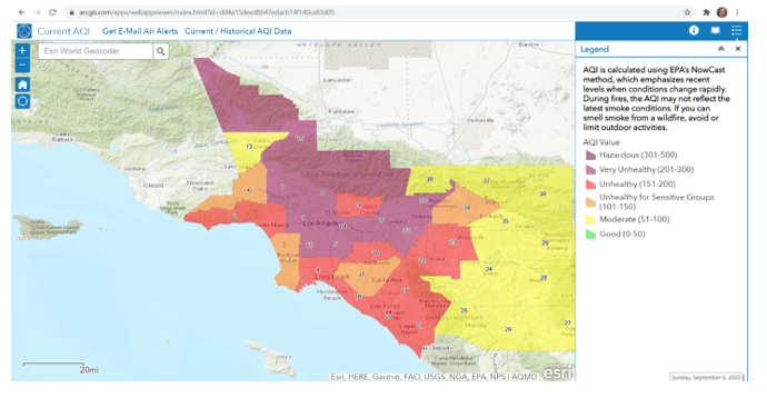 AQMD map September 6, 2020 at 2:27 p.m. The West San Fernando Valley – District 6 - is shown in orange on the west side of the map.
Why was the West San Fernando Valley looking like we had healthier air when our heat was the highest in the history of Los Angeles? It only reinforced my opinion that we needed more air quality monitors in the Los Angeles area as I referenced in my CityWatch article on May 20, 2020.
I reached out to the AQMD with my questions and I asked about the possibility of getting a new monitoring station at Pierce College where this intense heat was recorded. I was told a complete system, depending on what I wanted to test for, could cost in the hundreds of thousands of dollars.
I also learned of another air quality system throughout California known as PurpleAir, which uses private sector sensors for particulate matter. These sensors are important during our wildfires.
“A proven air quality monitoring solution for home enthusiasts and air quality professionals alike
Using a new generation of laser particle counters to provide real-time measurement of PM1.0, PM2.5 and PM10. PurpleAir sensors are easy to install and only require a power outlet and WiFi. They use WiFi to report in real time to the PurpleAir map.”
Due to our poor air quality, I was regularly navigating between the AQMD data for the West San Fernando Valley, the airnow.gov website, and the PurpleAir data. I wanted to know what the air quality was at the time – not based on an average over time.
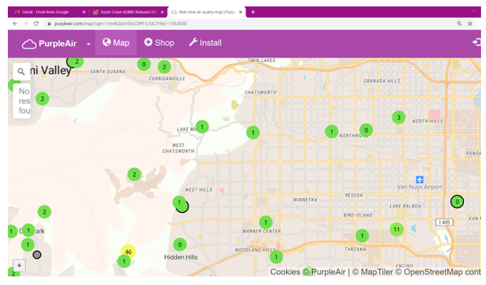
This is a PurpleAir map of the West San Fernando Valley showing locations of privately owned air sensors including one in West Hills. This map was generated February 28, 2021 at 0320 a.m.
The EPA AirNow sensors would reflect a 24-hour average.
“How is the NowCast algorithm used to report current air quality?
AirNow’s current air quality (NowCast AQI) data update hourly using readings from thousands of monitors across the country.
By definition, the AQI is calculated using data from a 24-hour period. That’s because the science we have about air pollution exposure and health is based on 24 hours and therefore EPA’s air quality standards are based on 24 hours. It is not valid to use shorter-term (e.g., hourly) data to calculate an AQI value. However, we want to report shorter-term data to caution people in time for them to reduce their 24-hour exposure. The NowCast is EPA’s method for relating hourly data to the AQI.
The NowCast is designed to be responsive to rapidly changing air quality conditions, such as during a wildfire. The NowCast calculation uses longer averages during periods of stable air quality and shorter averages when air quality is changing rapidly. The NowCast allows AirNow’s current conditions to align more closely with what people are actually seeing or experiencing. This gives people information they can use to protect their health when air quality is poor – and help them get outdoors and get exercise when air quality is good.”
AQMD: A new map and a new APP!
Late last year, the AQMD scientists and their technical team (thank you to your scientists and your technical team!) created a new grid-based map and a downloadable app. On their website, they explain how they calculate their new AQI (air quality index). Technical experts had to create and to name 1218 grid cells!
“How is my AQI determined?
Air Quality Index (AQI) values are determined using a technique developed by South Coast AQMD scientists and published in a peer-reviewed scientific journal that is considerably more accurate than other methods. This method blends measurements from high-quality regulatory monitors, quality-controlled and calibrated low-cost sensors, and an air quality model.
AQI at Monitored Locations
The current Air Quality Index (AQI) on the South coast AQMD website and app is calculated from measured and modeled concentrations of five pollutants: particle pollution (PM2.5 and PM10), ozone, nitrogen dioxide, and carbon monoxide. The “Current AQI” uses measurements of these pollutants at regulatory monitors that are operated by the South Coast AQMD, along with regulatory monitors operated by other agencies within or near the South Coast AQMD jurisdiction.
Regulatory monitoring locations within the South Coast AQMD jurisdiction are identified with markers on the AQI map. These regulatory monitors provide the most accurate concentration measurements, but due to finite resources, regulatory monitoring is not practical in every neighborhood.
The AQI Grid
To report air quality to a neighborhood level, the AQI map is shown using 1,218 grid cells. Each grid cell is 5 km (3.1 mi) x 5 km and is identified by a unique name.
Measurements from regulatory monitors are used to calculate AQI values in the grid cells where the monitors are located. South Coast AQMD staff have developed a state-of-the-art technique to calculate AQI values in every one of these grid cells, using a combination of data from regulatory monitors, low-cost fine particulate matter sensors, and an air quality model.”
Thank you AQMD for putting West Hills on your map:
 This map shows the AQMD AQI and data for West Hills. West Hills can be seen in a small blue box to the left of the enlarged box. These small blue boxes reflect the cells that are referenced in the discussion about how the AQMD calculates the AQI for an area. This map was from 2:00 am February 28, 2021.
It is important to show the distinction between the old maps used by the AQMD as reflected on September 6, 2020 (shown three maps above) and the new cell-based maps that are used today. However, when the air quality is good as it has been recently with our rain events earlier this year, it was hard to show that grid or cell pattern.
Another example of that pattern is a map that shows what happens when you click on a cell as I did with the first map on this article, taken on February 25, 2021 at 3:00 a.m.
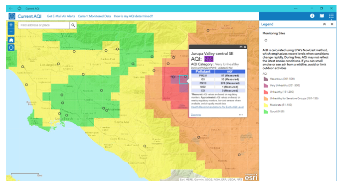
This map shows the Current AQI on February 25, 2021 at 3:00 a.m. I clicked on one of the cells in the purple-colored box which reflects very unhealthy air quality. The AQI for the cell named Jurupa Valley – central SE was 278. The 278 reflected the highest number – 278, which was the level of PM 10 (particulate level 10) for this area.
The Press Release:
I was surprised I did not receive the press release from the AQMD since I receive their notices daily and whenever there is an air quality advisory. I reached out to them and received their Press Release dated December 10, 2020:
“South Coast AQMD Releases Enhanced Mobile App with Greater Accuracy for Checking Local Air Quality Update makes South Coast AQMD the most advanced air monitoring app in the region.”
The APP
“About the South Coast AQMD app The South Coast AQMD app is the official air quality app for residents of the South Coast Air Quality Management District. Air quality experts provide real-time and forecasted air quality information using the highest quality data and scientifically validated methods. The award-winning app is free and available for Apple and Android devices on the App Store and Google Play.”
Conclusion
I want to thank the South Coastal Air Quality Management District for taking the time to create a more real time map and a downloadable app that more accurately reflect the true air quality and not an estimate over a 24-hour period.
These maps are updated hourly to reflect constantly changing data. It is important for our regulatory agencies and health officials, as well as the public, to be able to access the true air quality in real time. This is especially the case during periods of heavy winds, wildfire events, or when there is high heat that contributes to increased ozone levels.
(Chris Rowe, a former health care employee who has worked at Northridge Hospital, Tarzana Medical Center, and West Hills Hospital has a B.S. in Health Education. She is a 42-year resident of West Hills. She has written for the Los Angeles Daily News, RonKayeLA.org; OurLA.org; and CityWatch. She has a blog on the USC/Annenberg Center for Health Journalism website and can be reached at [email protected]) Edited for CityWatch by Linda Abrams.

